RGB, CMYK, and PANTONE: What does it all mean and why do I care?
by Tami Murphy | 25 Aug 2022
General
In the most basic terms, RGB and CMYK are modes of mixing color used by graphic designers in creating product art. And you care because you want your product to look the way you designed it.
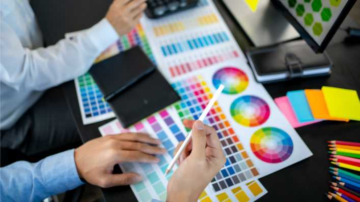
RGB (Red, Green, Blue) is used for digital graphics, it should not be used in printing. RGB is the optical color, that is, the color seen on the computer screen or mobile phone screen. Its color scale is 0-255, and because RGB is color light, the superposition of colors is getting more and more bright. When the three RGB color values are all 255, it will become white, in contrast when the three RGB color values are 0, it will become black.
Printing presses are typically set up for CMYK (Cyan, Magenta, Yellow and blacK) this is called process printing. CMYK is a color composed of colorants, its scale is 0-100, and the color overlay is darker and darker. In addition, CMYK has a standard color card for color matching, thus when printing multiple runs over time, the color should stay consistent. Think back to your days of finger painting and you wanted to paint the leaves of a tree green, to do that, your younger self mixed yellow and blue fingerpaints to create your green tree masterpiece. In CMYK, you would set the press at 100%C+0%M+100%Y+0%K, which is green on the color card, while pure black is always 0%C + 0%M + 0%Y + 100%K. This is the standard.
Since the color formation principles of RGB and CMYK are completely different, when art files used for printing are not converted into CMYK, printing from one run to another will have color deviations. Therefore, when making print files or processing photo files into print materials, be sure to always convert to CMYK.
As for PMS (Pantone Matching System), this is a proprietary color system. Each color is created using a combination of different pigments to achieve the desired PMS color. For printing purposes, Pantone colors can be converted into CMYK. But because Pantone colors provide no variation from one printing run to another, when it is necessary for 100% consistency from one production run to another you may choose to use Pantone colors, this is called spot printing. It is not uncommon for a print job to be CMYK plus Pantone when one component of the art is color imperative. Perhaps you have an expansion pack that the back of the cards or a logo must match over numerous titles, you may choose Pantone to achieve that consistency. Choosing whether to use Pantone in your printing becomes a balance of cost and the importance from a creative perspective on a project.
Printing with Pantone colors is more expensive than printing in full CMYK. Without going too far into an explanation on printing, the main reason behind the increase in cost is due to set up and clean up. Every color used needs a press plate, CMYK means 4 plates, and any additional colors each need their own plate. And on the back end, the ink wells used in the printing press need to be cleaned after a printing job, so again every color needed is an ink well that needs cleaning. You can see where the costs for each Pantone color begin to add up in the overall cost of a project.
This explanation is very basic and people well versed with the printing process would probably expand on each color mode quite a bit as well as the mechanics of the printing press itself. If you take one thing away from this layman’s explanation, take away the fact that in this digital age, RGB is a very common color mode for graphic artists, but it is just that – digital. It is not meant for printing presses, so ALWAYS convert your artwork to CMYK or CMYK plus Pantone.
Recent Blogs
The Bloom Report
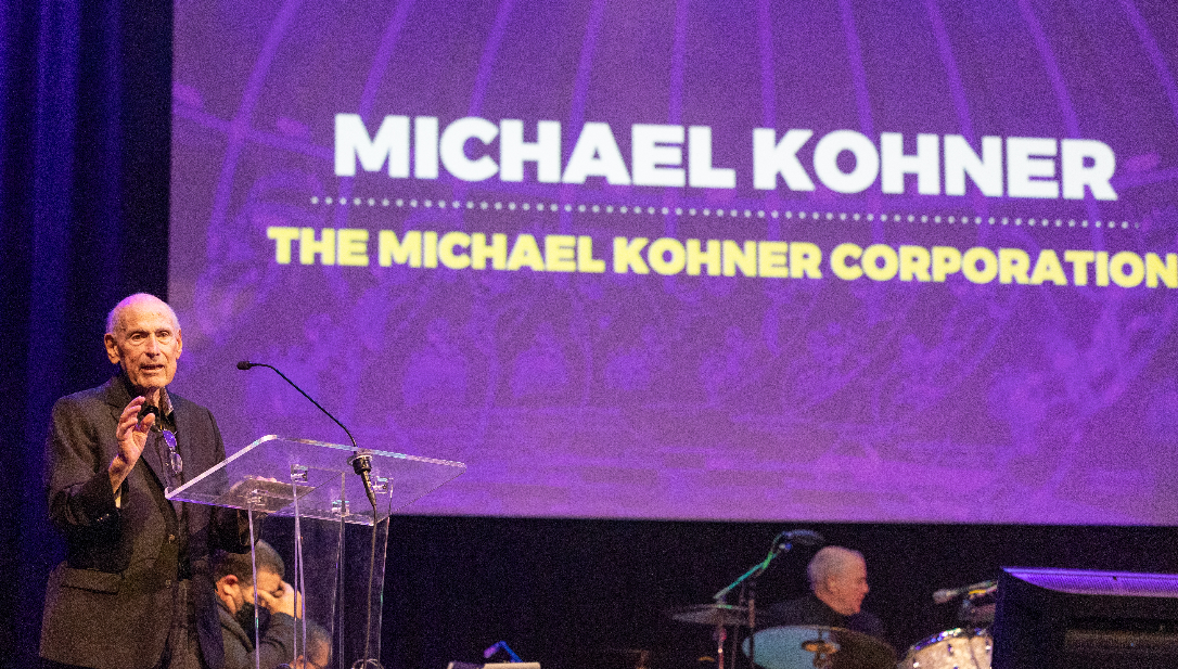
In Memory of Michael Kohner — A Toy Industry Legend and a True Gentleman of Play

The Bloom Report
Reyn Guyer’s Next 15 Minutes of Fun
The Bloom Report
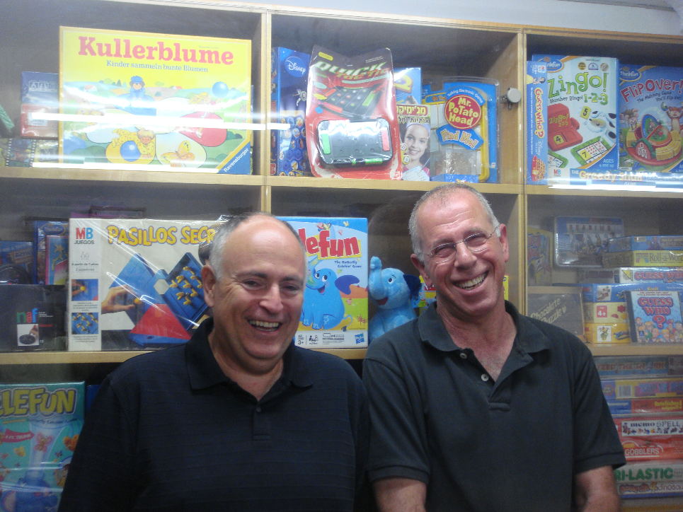
Boaz Coster Talks Creating Elefun, It's Return, and More!
General
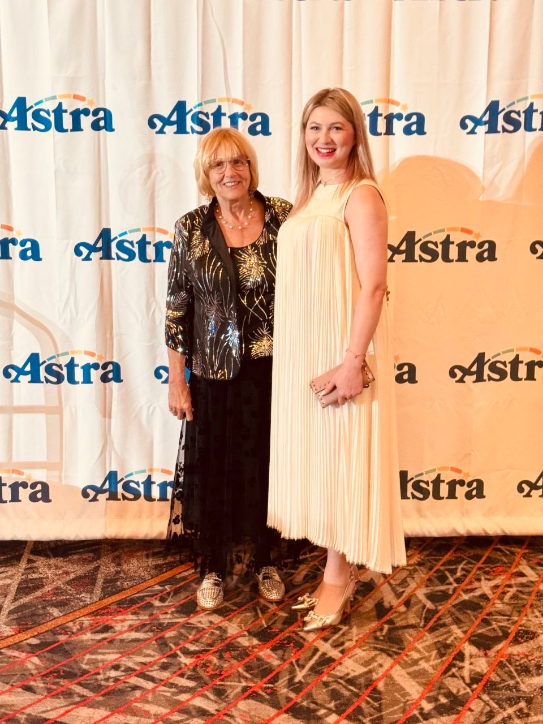
More Than an Exhibition: A Journey of Inspiration and New Friendships at ASTRA

Press Release
Sari Wiaz, Baby Paper - The Story No One is Covering..How are small brands surviving?
See more
Recent Wiki
BOOK REVIEWS
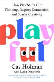
Book Review: Playful: How Play Shifts Our Thinking, Inspires Connection, and Sparks Creativity by Cas Holman
COMPANIES
New tabletop trading platform

PEOPLE
Jonathan Berkowitz, CEO of PlayMonster, Talks Hacky Sacks, Gen Z Trends, and the Value of Simplicity
COMPANIES
The Association for Games and Puzzles International Announce Speakers and Outstanding Achievement Honoree

COMPANIES
The Bedtime Battle and Why SleepToy is Reimagining Evening Routines
See more
POP's Got Talent

POP Entertainment
Randy Klimpert Shares his Ukulele Collection
POP Entertainment
Steve Casino Peanut Art
POP Entertainment
Everyone's Talking about POP!
POP Entertainment
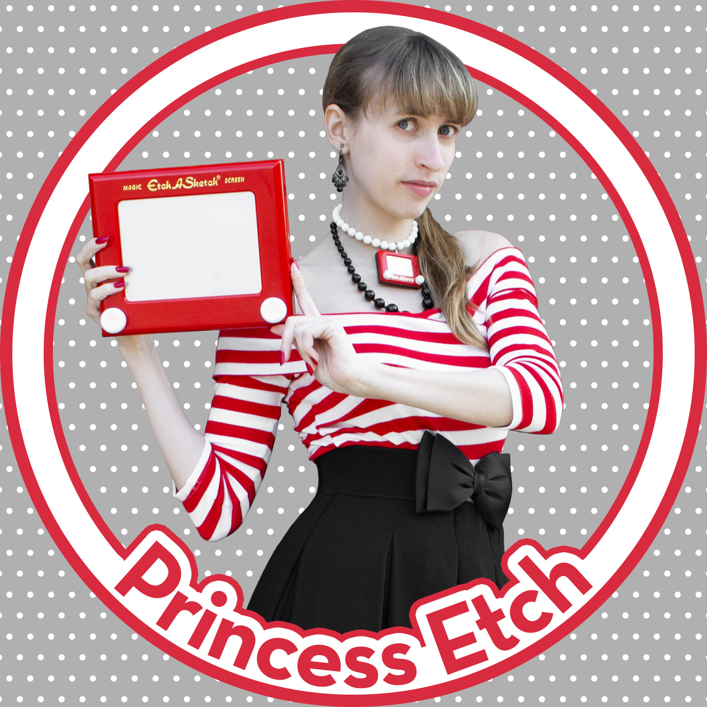
Princess Etch - a Multi-Talented Etch A Sketch Artist

POP Entertainment
Joseph Herscher of Joseph' s Machines.
See more
Recent POPcast

Hidden Role: The Brains Behind your Favorite Games
Brent Bushnell talks Two Bit Circus, VR, & STEAM (Part 1)
Hidden Role: The Brains Behind your Favorite Games
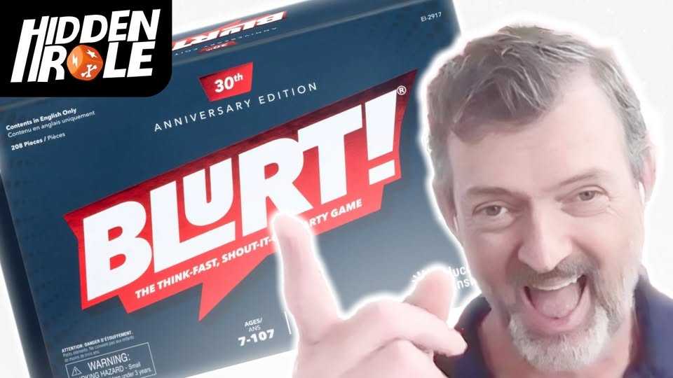
Tim Walsh Celebrates the 30th Anniversary of Blurt!
Hidden Role: The Brains Behind your Favorite Games
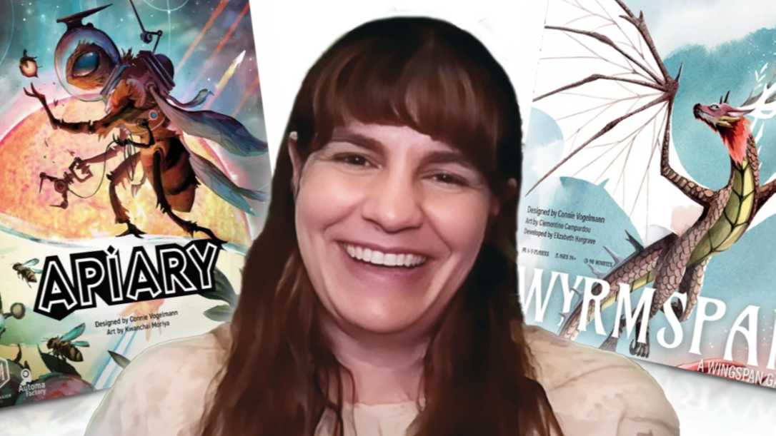
Connie Vogelmann designed Apiary & Wyrmspan!
Hidden Role: The Brains Behind your Favorite Games
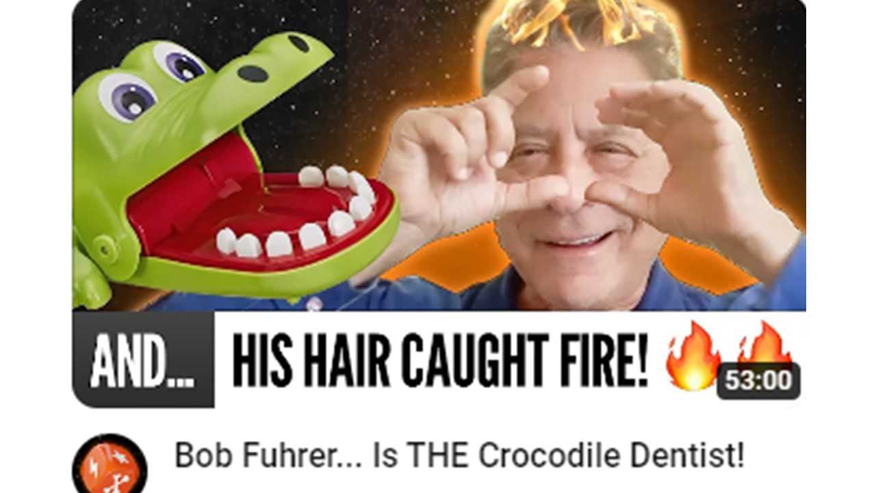
Bob Fuhrer... Is THE Crocodile Dentist!
Hidden Role: The Brains Behind your Favorite Games
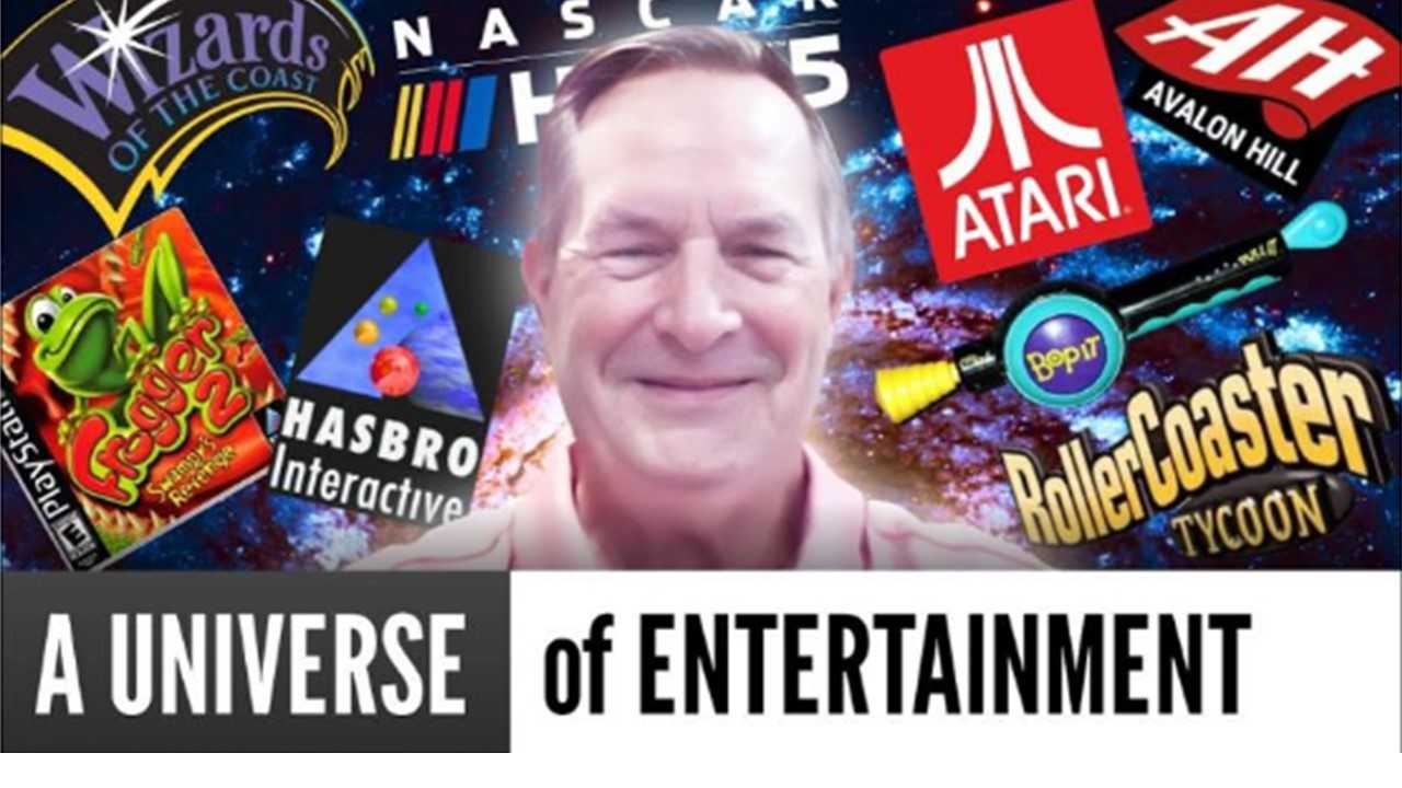
Tom Dusenberry... Bought Atari, Wizards of the Coast, and Avalon Hill!
See more
POPDuos

POPDuos: Interviews with Legends and Leaders
POPDuo: Richard Dickson, Mattel’s President & COO, and Kedar Narayan, Young Inventor Challenge AMB

POPDuos: Interviews with Legends and Leaders
POPDuo: Will Shortz and Josh Wardle

POPDuos: Legends and Leaders Explore Creativity
POP Duo: Elan Lee, Co-Founder, Exploding Kittens.and Jeff Probst, Host and Exec Producer, Survivor
POPDuos: Legends and Leaders Explore Creativity
POP Duo: David Fuhrer, MNG Director, Blue Sq Innovations & Shawn Green, past Dodgers & Mets MLB Star

POPDuos: Legends and Leaders Explore Creativity
POP Duo: Bob Fuhrer, Founder, Nextoy and Tom Fazio, Golf Course Designer
See more
Featured Articles
The Bloom Report
Toy Inventors--The Heart and Soul of the Industry
The Bloom Report
Brian Turtle: 'Endless' Stories, Advice, Kevin Bacon and More! tBR Person of the Week
Biographies and Interviews
Jonathan Levy on Jon2.0 - from Co-Founding Mastermind Toys to Spin Master
Biographies and Interviews
Andrew Perlmutter's Journey from Glencoe to Funko with Crazy Ideas that turned out Golden
See more